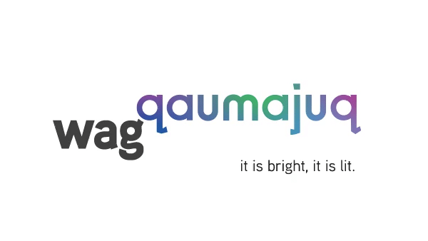
Introducing the new WAG-Qaumajuq Visual Identity
With the opening of Qaumajuq, the Gallery worked with long-time design partner Doowah Design Inc. and Inuk graphic designer Mark Bennett to find a way to integrate Qaumajuq into the well-established WAG brand.
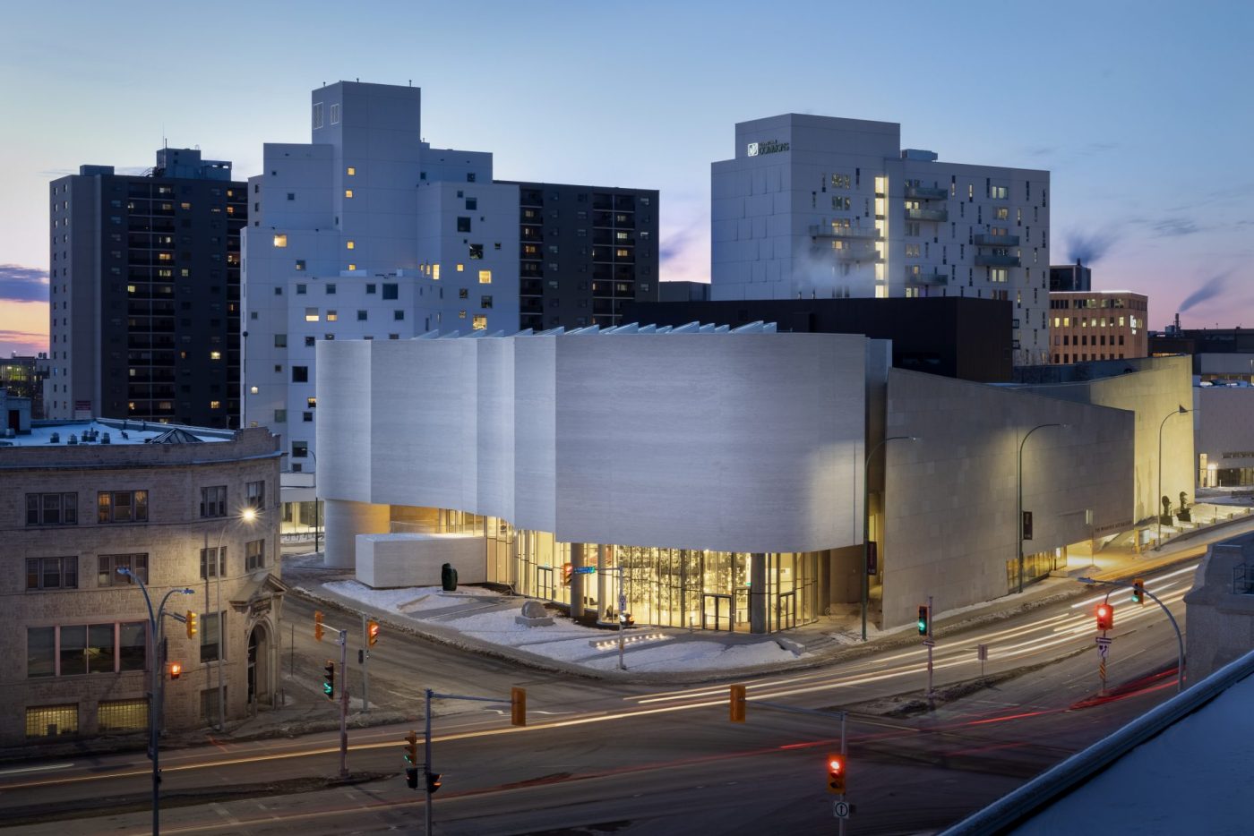
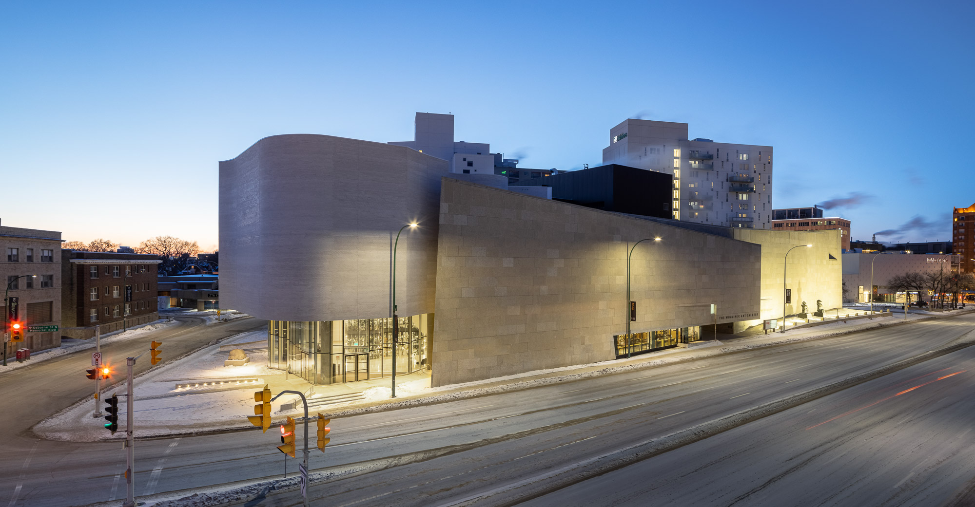
To evolve the WAG-Qaumajuq brand, the designers took inspiration from the two buildings and their relationship to one another. The WAG building’s solid stone structure grounds the site and seems to absorb light, while Qaumajuq’s organic design almost floats in the air, with glittering stone that sparkles. Our new visual identity mimics these features, with a soapstone grey WAG anchoring the addition of the elevated Qaumajuq.
By starting with the modernist sans-serif font used for the most recent WAG acronym, designer Mark Bennett created a hand-drawn font for Qaumajuq. This new font pays homage to the Gallery’s modernist history, while establishing a more contemporary, playful, visual identity.
Learn more about Mark and the intention behind his design here.
The aurora pattern is inspired by the natural light display of the northern hemisphere. Named after the Roman goddess of the dawn and god of the north wind, Aurora Borealis means dawn of the north. A solid colour palette of 12 key tints is sampled from the aurora pattern and additional colours can be sampled by the WAG-Qaumajuq design team at any time, giving our designers endless colour options to work with – which we think it pretty cool for an art gallery.
You’ll notice these key colours and our new visual identity on our website, on signage, ads, and other promotional materials – we hope you love it as much as we do!
Feedback for our Engagement Team? Reach out to us at communications@wag.ca
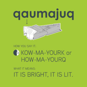
Call us WAG-Qaumajuq. Have you mastered your pronunciation? Winnipeg Art Gallery (WAG) is now WAG-Qaumajuq (KOW-MA-YOURK). This hyphenated name reflects the important relationship between these two spaces. Hear all our new space names and practice your pronunciation here.
3 thoughts on "Introducing the new WAG-Qaumajuq Visual Identity"
Leave a Reply
To plan your visit, check out wag.ca/visit.

I like your new branding. Its simplicity is deceiving, yet its colours represent the blending of two cultures while at the same time demonstrating our modernity. Bravo to WAG-Qaumajug!
Thank you Sophia!
Very inspired in terms of ” difference of levels in the 2 parts of the new museum” and the reference of dancing colors of the northern lights…totally effective and poetic.
BRAVO your logo really evoques the spirit of your “lieu
Ginette Dumouchel