WAG-Qaumajuq Brand Identity Evolution
Over the past year, the WAG-Qaumajuq Engagement team has worked closely with our design partners to advance the brand in a way that properly reflects the artwork featured within the Gallery walls. The new brand identity is the result of a collaboration between longstanding WAG design associate Doowah Design Inc., who did a thorough exploration of the Gallery’s brand history, and Inuit Graphic Designer Mark Bennett, who brought his incredible design talent and community perspective to the project. We sat down with Mark Bennett to discuss some of the design inspiration behind the evolved brand identity.
Q: Hi Mark! Could you introduce yourself to our followers?
A: My name is Mark Bennett and I’m a graphic designer. I’m based out of Tkaronto (Toronto), where I’ve lived for the last 10 years, but I’m originally from western Newfoundland. I’m mixed – Inuk, white and Hispanic – and I’m a registered Nunatsiavut beneficiary. I found myself in Winnipeg for the 2022 Inuit Studies Conference with a cohort of other Inuit and Indigenous folks.
Q: What made you pursue a career in graphic design?
A: Growing up in a small town was isolating for me, and I always felt out of place. I took refuge in music and snowboarding – making mix tapes, into DIY art, punk and influenced by videos and graphics from taped off skate/snowboard videos from friends of friends. Basically, I leaned into these things and when it came time for me to choose what to do after high school, graphic design was an obvious choice for me since it’s a field that funnels all my interests together.
Q: What aspects of your background and upbringing have shaped your design philosophies and principles?
A: For the longest time I was always looking outward and away from my hometown for inspiration. A big part of that was because I grew up disconnected from my Inuk culture – it’s complicated, like many other Indigenous folks. As a family, we visited Labrador over the years, but essentially, it didn’t play a big part of my development in graphic design. Part of that came from having no Indigenous role models in my community, another part shame and of a colonized mindset, and I just didn’t have the resources or people around me to connect with. It wasn’t until later, when my siblings started to connect more of the dots, and when I lived in Toronto and met other Inuks, and when I got into architecture school, I started to think about a few questions about the work I wanted to make. What is true to me and worth talking about? What would add to the world in a way that’s not solely about consumption and nice-looking things? And I started to think about my own exploration with identity and where I was with it. I wanted to bring some of my own questions, challenges, and ideas to the design work I was exploring in architecture school. It was almost a “live feed” of these questions translated into design. This carried over into my graphic design practice and it’s a fluid exploration, always changing.
Q: Outside of graphic design, what are you currently interested in that also influences your design?
A: Music is one of my biggest influences. But also, conversations with friends, family, colleagues – community. I’ve been reading more design discourse and critical thinking. Another project I’ve had the opportunity to see from working on in smaller roles (graphic design, photography) is what’s happening on Fogo Island, Newfoundland. What Zita Cobb and everyone there is doing is probably the most foundational influence for me when thinking about designed object. How they’ve created the project from the ground up and having narrative as the seed for every object and design they’ve created changed my perception in cultural value on what I think of with Newfoundland, and everything else I work on – essentially, everyone has an interesting story to tell and I encourage everyone to find what drives anything you design in your process to give substance. I went to design school, but it was a two year technical school. It was all of these experiences outside of school that became a conceptual influence, including the friends in the art and music scene in St. John’s, Newfoundland (where I lived for ~9 years before moving to Toronto).
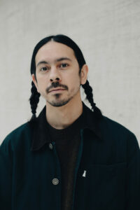
Mark Bennett. Photo by: Julia Soudat
Q: Could you describe the new brand identity and the background behind the design – what is the story behind it?
A: It all started with conversations with the WAG and Doowah Design Inc., who have a great working relationship with the WAG. The more conversations we had and the research I did by working on adjacent projects like the INUA Publication design and art direction/design of the special issue of Inuit Art Quarterly magazine, all helped shape what I learned. The more I got into experimentation based off the work done by Doowah Designs, the more I realized there was an opportunity to create a custom typeface. There was encouragement from the Gallery to do what feels right and I decided to take cues from the architect and the ideas behind the building. I played with that idea and translated it to the typeface. More importantly though, I referred back to questions about process I’ve been interested in. What is Inuit graphic design? I wanted to create a typeface that doesn’t reject modernism – as much as I’ve toyed with the idea – but one that takes it in a new direction, and fits in the middle between a certain treatment. It’s more of an embrace of ideology – how do we make it our own for cultural autonomy, but also make it look contemporary, timeless, and still have character?
Q: How did the design develop, from the idea to the realization?
A: What started as choosing a typeface that fit the idea of Indigeneity, it flipped and went from how do we take the concept of Indigeneity and have it become a new foundation for the WAG to work from. If there’s anything I want other Indigenous designers to take away from this, it’s realizing that creating your own process gives you a certain amount of freedom to define your own rules and outcomes. By approaching design in a way that realizes cultural sovereignty first, it really does give you the power to embrace decolonization in a way that’s autonomous. Thankfully the WAG and everyone I’ve worked with on this project have been very positive, encouraging, and great collaborators, allowing me to create the process I need.
Q: What about Qaumajuq-the building or art or programming-inspired or influenced you in this process?
A: The shapes are an obvious connection for me, but there are moments between the buildings – how they never touch, how they are completely different in design but still complement each other – allowed me to carry those ideas into the play between the text “WAG” and “Qaumajuq”. There is a typeface used in the original building design from the 1970s that gave a reference point. The variable shapes in the descenders of the letters are a little different – things like that. Another influence Nasogaluak’s piece W.3-1258 in INUA and Kayla Bruce’s programming around that artwork with the kids who come in and talk about the Eskimo tag system. This idea of allowing kids to think about perception, what their culture means to them – this was one of my favourite pieces of programming and it had me thinking about Inuit culture, perception, and autonomy. Lastly, hearing Aluki Kotierk speak about the Inuktitut language at the 2022 Inuit Studies Conference. She essentially asked us all to do what we can to keep the language alive. This reinforced my recommendation to keep the full word Qaumajuq in the visual identity to ensure we educate the public with familiarity, but also to reinforce the concept of reversing cultural erasure. Thankfully everyone involved at WAG supports and understands this.
Q: Could you describe how you worked through the process of design, did any interesting things come up in this process?
A: Conversations, listening, reading, and experimenting – that’s essentially how it happened. Giving the project the right amount of space to sit with the conversations and notes I’d take down when meeting virtually with the WAG and Doowah Design Inc. Then having conversations with friends adjacently that had nothing to do with this project but connected back since they were culturally relevant. I’m someone who overthinks a lot – which is good and bad haha, but the result is I’m always connecting ideas and ways of exploring to each other.
Q: What are you most proud of with this design?
A: The process itself is a highlight, but having the variable letterforms, as simple as that is, is the satisfying part. A project’s process must feel right for the outcome to feel right. It’s said often by designers, but it’s so true. The more I learn about design, the more I focus on process and try and forget expectations I have from the beginning. This is one of those projects where the conversations with different people really helped the outcome of the design, so I’m proud of the process.
Q: What was your biggest design challenge?
A: The current design before this new wordmark was great. When you work on a project that is already successful, sometimes you think to yourself “ok, how am I going to top this?” Going back to process again, on a project like this that’s where the ideas form, so it was in some ways forgetting about the current visual identity and asking questions and starting from scratch to shape the
visual identity. Much like a soapstone sculpture can already ‘be there’ in the stone and the carver just lets it out, sometimes graphic design can be seen in a similar way.
Q: What do you hope visitors and the public come away with after interacting with the design?
A: If anything, I’d want people to not focus on the wordmark as odd as that may sound. Of course, I want it to be clearly identifiable and on closer look, the variable letterforms are seen, but as mentioned, I think it’s the process and story of how an institution like WAG was more than eager to work with an Inuk to lead a visual identity exploration. Other institutions can take cues from this process, as decolonizing is a buzzword and too many organizations are colonizing decolonization.
Q: Your work has been featured as part of INUA, Inuit Art Quarterly, and more – and now Qaumajuq – what do you feel when you see your work as a central part of these landmark and influential Inuit art projects?
A: I’m happy and feel lucky to have the opportunity to be involved in these projects. It can be challenging at times when you’re being critical with yourself, and you feel the weight of everything you’ve learned and haven’t yet learned.
Q: What are you most excited about with the opening of Qaumajuq?
A: It was the perfect setting to step into the WAG for the first time while the Inuit Studies Conference was on. It was important to me to connect with many friends who I’ve met over the last few years, and to meet new ones. I couldn’t have asked for a better group of people to experience it with. It really is about community and celebration, and being there on National Indigenous People’s Day was pretty special. Being able to gather, while surrounded by these incredible artworks.
Q: Anything else you’d like to share?
A: I encourage more Inuit to get into graphic design. There’s a whole world of exploration, especially outside of the commercial perception of graphic design. When I first got into the field I was more in tune with agency and capitalist driven design. It wasn’t until later I’ve learned that there’s so much to learn from your own culture and it can be framed as design, whether it’s creating objects like furniture, books or posters. Design can be used in a very positive way that enhances our experience in the world and there’s so much opportunity for us to take inspiration from different aspects of culture and create design from it – that’s exciting to me.
Related Stories
The new public hours for the Gallery, ShopWAG, and Katita Café are Wednesday to Sunday, 11am-5pm. For more information, click here.
